Larinna: ylan0827 | Danny: dfen4827 | Christine: mzha8807

According to the feedbacks we received from the test fair, we spent around one week on evaluate the results to figure out the insight of the problems and make certain adjustment to our previous design in order to better meet user needs and improve the overall user experience.
Refine One: Login Section
Interfaces of previous design
Problem 1:
Time consuming login process: We found that our participants from Test Fair spent longer time on logging process than what we expected, which some of them pointed out that they fell a bit inconvenient and time-consuming about the login task. By analysing the results, there are three main factors that caused such problem:
- Unclear text instruction: We designed an instruction for novice user for first use. However, the instruction in terms of text form and the layout design affects the reading efficiency and effectiveness to some extent.
- Unfamiliar tool: The use of QR code seems cannot address the logging efficiency as expected, while some participants misunderstood the usage.
- Spatial limitation: Because the whole process of logging task can be conducted only within the scanning zone, it greatly restricted the logging efficiency, and would result in unfriendly experience for the participants.
Problem 2:
Limited choices for content logging: The previous design only considered one social network application which is Facebook, while in practical the product should face to all residents in a particular neighbourhood, which will involve users from other social platform and someone who is not a fan of social networking.
Problem 3:
The lack of closed-off design for logging: We found that as user information would be collected by the system, many participants were worried about the security of their account. User expects to have more control about their personal information management to achieve high security sense, which the previous design did not satisfy such demand.
Resolution for problem 1, 2 & 3:
Merging design – NeighbourHub website
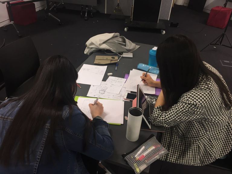
Sketches of the refine interface

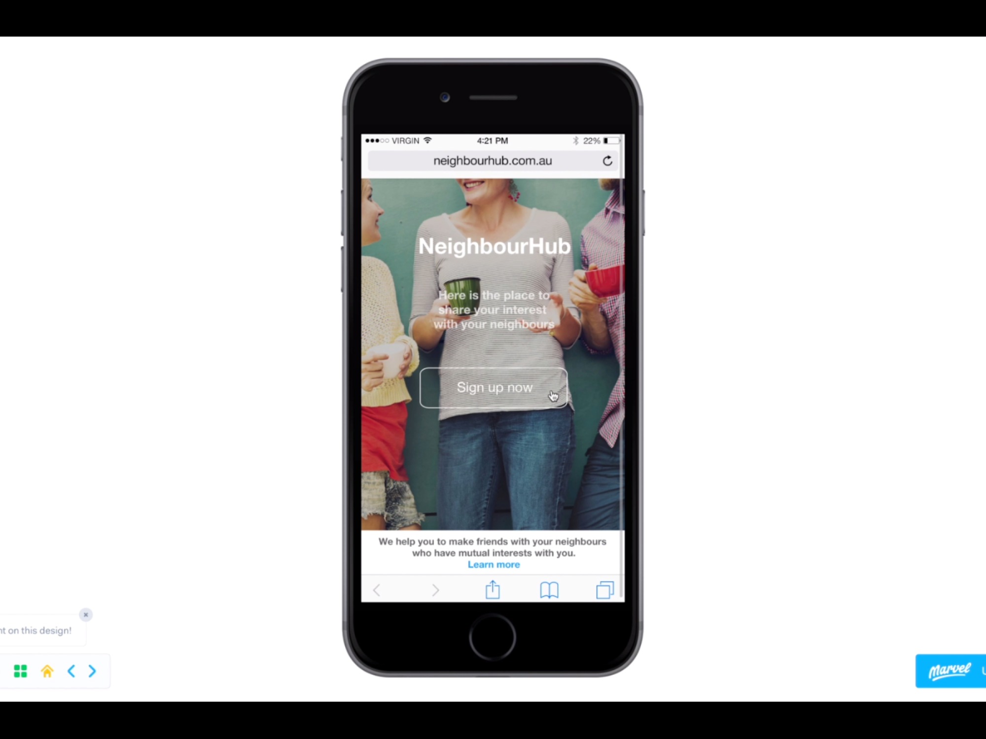
Interfaces of the NeighbourHub website on Marvelapp.com
To improve the user experience and maximum utilize the space outside the interaction zone and the waiting time of our potential participants, we built a website and transferred most of the content to it so that users can well control the sign-up and login time as well as their own personal details. The new feathers of the design as shown below:
- Sign up for the website: This concept aims to prevent user details from tracking by others, no matter it is malicious or unmeant, and improve the sense of security about our system. (Addressing problem 1)
- Simplified flow and more natural instruction: Instead of placing crowded text instruction within one page, we successfully got rid of the extra instruction and left more white space to giving items room to breath as well as improve the comfortableness of viewing. The whole process is divided into several steps from login to social networking to create tag-cloud to build own content panel, which will be easier to follow and complete the task in a relaxed context. (Addressing problem 1)
- Alternative login design: As shown consideration above, the new system provides multiple options for logging to other social media account as well as locally generating interest content, to meet the majority of needs in regards to content logging. (Addressing problem 2)
- Verification code method: A more familiar and memorable code method is offered to improve the efficiency and friendliness of logging process in this case. (Addressing problem 1)
- Leave option: (Addressing problem 3) Provide a “Leave” button at the bottom of the bubble interface/control panel, allow user to log out their personal content after the activity to eliminate security concern.
Demonstration URL: https://www.youtube.com/watch?v=Y6g4KhkV8ro
Refine Two: Public Display Section

Previous interface on public display
Problem 4:
The lack of learnability of interface in public display: Many first time users in Test Fair found it hard to understand the representation of real-time visualisation effects.
- Content visibility: Due to time and technical limitation, the appearance of the interface is not very high fidelity. As a result lots of users in Test Fair found it hard to understand the meaning and representation of the visualization after pressing the interest buttons. The only text indication we provided on the screen was the user name in the middle of the visual circle, other features are all represented by visual effects (coloured connection lines, filled circles etc.)
- Direction visibility: Direction indicator is a key feature in our product, which can guide user to reach other people in the same playing field. We made the effect of text rotation to indicate direction, many users found it interesting to see the rotation, however the direction is not clearly shown to guide the user.
Resolution for problem 4:
Interface improvement:
In order to solve the above problems, we decided to improve the overall appearance of the interface to provide an easier and understandable user experience.

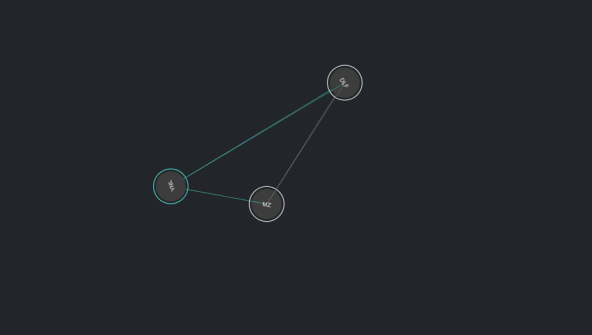
Refine interface on public display
- Real-time content feedback: users in test fair were keen on receiving responsive information which can assist the understanding of the visualised features. Therefore, not only showing the username content on the public screen, we also provide the text showing which interest the user had pressed and the interest category.
- Visibility of direction: instead of text rotation, we designed an arrow indicator on each user’s circle to provide a clearer direction guide.
- Increase the colours: Increase the matching colour corresponding to different interests (originally only 3 provided).
- Visibility of user connection: As the key theme of our product is to connect people who have common interest, and make contents of user interests visible on public, we enhance the change behaviour visualisation to provide a direct sense of connection and a better visual attraction to improve the user experience.
3 different connection lines are designed to show different status:
- Transparent dimmed line between users to show there are some common interest among the users but no one had pressed any interest buttons. (attract user to find out what exactly is the interest that they have similarly to others)
- Filled circles and coloured glowing line between users to show both users had pressed the same common interest button simultaneously.
- Coloured thin line between users to show only one side had pressed the common interest.
Conclusion
Honestly, we did not have much time to test the new features that whether they well addressed the previous issues or not, and there are many other concepts in the refine stage that are not able to consider and achieve due to the same reason. But overall, we considered the majority of feedbacks and made improvement in relevant sections to eliminate such issues which made our product become more integrated and user friendly. As designers, we are very proud of what we had achieved, and we are appreciated about what we learnt from this project. The whole design process and concept development method would assist us to think from different angles in the future.
Group LCD


Dannayyyyyyy!!!!!!!
LikeLiked by 1 person